Monday, 15 April 2013

High Poly Character V2 - Project 1 B resub

My final character is a Rock Back Turtle! A turtle that has grown in size and composition. With defenseless herbivorous perishing in great numbers due to rising waters and reduced land space the lowly turtle had to adapt to survive. Through evolution the Rock Back Turtle's shell lumped rocks and dirt over its shell to the point of creating a small ecosystem atop its back with nourishing mushrooms to fed on. The grassy mound doubles as an ingenious disguise to hide itself from viscous predators. The Rock Back Turtle spends much of its time slowly trudging through the low under crops of enormous forests, searching for rays of light to grow its shells foliage to keep him well fed.

One of the major issues I had to face when developing my low poly character was how essential it was to find a way to create a grass effect on the characters body. Its a major design aesthetic of the character and it needed to be created in a way that would not compromise on computer performance, render time and overall logistics of high poly character modelling.

I decided to create a transformed plane poly with a png transparency texture. This way a basic two dimensional grass was created. With a few duplication's and tweaking a low poly grass clump was created. With this low poly replacement for something like the fur tool or paint tool (incredibly high poly) a really nice effect was created.


The re-texturing of the model brought the character to life in a really organic and natural way. The level of detail in the arrangement of the grass was something I spent many hours playing around with and I think it really paid off in this case, especially when comparing it to the prior model.


Building grass over the model, I thought a little grass beard could look cool but decided against it as it covered too much of the characters face and drew attention away from it.


Initial rock and mushroom coverage

Animating the character was impossible with such a high poly count, by using reduced poly grass it lowered the amount of polys compared to if I tried to populate the character with the grass or fur paintbrush effects. But this characters animations were always going to be very simple and clunky considering what he is, his body is a shell that is supposed to stay static that would simply sway from left to right as his legs moved him along, this is seen in the low poly animations.

Here is a basic playblast of how the character would move, his limbs are reasonably restricted and hidden anyway so the animation is meant to be basic.


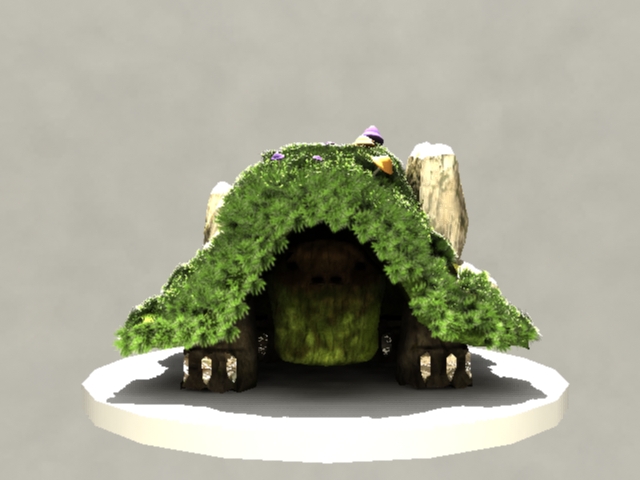
For the final turn table and hi-res renders I went for a slick lighting scheme to try and put the character in a sunny environment, as this suits his character perfectly. Using mental ray and messing around with the shaders and illumination details the grass clumps look reaaallly impressive. The rocks also have a really nice shiny tinge to them just like as if he was walking around a sunny forest or meadow. 

I think I accomplished my goal of re-texturing my character and bringing him to life in a creative and imaginative way. 


Turntable:


Wednesday, 10 April 2013

High Poly Character - Project 1 B

BUILDING IN MAYA FROM LOW POLY

Initially I used my original low poly model to begin creating a high poly mesh for texturing, but almost straight away I found a better way to model my character so it look more like the isometric and concept drawings from the beginning. 


I messed around for countless hours trying to get a dynamic grass fur looking good but it was reasonably unresponsive and by the end of painting ever face that needed grass it was incredibly processor dependent so I decided to go for a normalized grass texture on blinn, the colouring was done with a PSN connection.


RENDERS


HIGH QUALITY RENDERS


HD BABY 


By the end of the texturing and animation process I feel I have developed this character well from my original concept drawings and a great deal since my first low poly mesh.


Sunday, 7 April 2013

Early Concepts for Duck, Death and the Tulip

Re imagining  Duck, Death and the Tulip has some very open ended possibilities. Most of the illustrations do not have any depth of field. I want to redesign the book to include animated and interestingly creative backgrounds. Grass, leaves and wind can all be animated easily and are very effective at engaging the audience.


I want the interactions to be as hands on as possible, in the above image the viewer would literally turn Death's head to look at the Duck, the sentences are merely ques for user interaction. So the viewer will rotate Death's head, and once in position the rest of the senses prompts and story line will be revealed. 

The crow could also be used as a story driver and cool piece of interaction, although not entirely important in the paper back version it is still a significant item to include. Perhaps the crow is flying around the heads of the Duck and Death as they are in the tree tops and the user has to push the crow to have it animate and perch on the tree top next to Death in order to continue the animation. 

Shaking the screen to change the weather as the narrator indicates the changing of weather from summer to winter would be interesting too. 


When death sends Duck on her way down the river the user has to blow the iPad to initiate the animation of the Duck travelling off into the distance, eventually triggering the last scene in the story. 

When Duck gets frozen in place when she realizes its Death standing opposite her, the user has can shake the iPad to continue the story. 

When Death places the tulip Duck the user has to press and drag the tulip into Ducks chest to continue the story.


Having the tree top shake and sway from the left to right as the accelerometer reacts to the movement of the ipad could be an interesting touch. Leaves and such could float down off the screen or accumulate on the grass below.

Text boxes that do not need a certain interaction in order to progress the story can be simple text boxes that the user can swipe off the screen to go to the next part of the story text.

When Duck says she can see the pond from atop the tree the user can tilt the iPad forward to change the angle of a seemingly two dimensional scene to reveal the pond below. 

Remaking the environments and layout of each scene will be of huge importance when remaking this story, I want to populate the scenes with the existing artwork but change it in a way to create more of a mood for the story. I envision a sort of Tim Burton / Nightmare before Christmas art style so a lot of items and visual elements will need to be made to create this style whilst also staying true to the feel and simplicity of the original. 


Sunday, 24 March 2013

Website Development

When creating the style of my website I wanted it to be slick and fluent. The site is an architecture portfolio of sorts. Showcasing some of the most influential architects of the last century. This site of course is highly image based showcasing the designs and final products of these acclaimed architects.

The navigation of the sight was a main design concern for me. I wanted the website to be based on a single page as this kind of website is aesthetically popular these days and I wanted to encompass some skills in jquery and java scripting. I chose to display everything within a fixed loop light box gallery. This way the person can press on any of the designers and flick through their personal gallery of images, but by integrating the other architects to fluently pass onto the next and combine galleries I aimed to make a polished and free flowing gallery based image site. 

The aesthetic choices are obvious, black and white colour schemes are used to link back to the architects themselves, half of which were born in the late 1800's. Also architectural buildings often have a unique aesthetic value when seen in black and white. 

Some initial layout designs:


Image above shows some consideration of the way in which the multiple light boxes will control the flow of the galleries


Some initial designs, layout of images is experimented.


The final layout was a kind of mix of most of my concepts. When getting down to the coding of the layout the current layout worked better than the rest in terms of user interaction and simplicity stylistically also. 

The logo was of course important too, the header fits across the entire body of the screen. I used the 960 grid for considering how the site will look on ipad and iphone, the 960 grid is perfect for such scaling issues and image stacking. The light boxes work perfectly on any device and this was another choice I made when designing the site. 


Just some basic geometrical concepts for an architecture logo.


Final logo


Footer used for the bottom of the site. 


A screen shot showing the layout of the galleries in the background and the light box image in the foreground. 

A few problems with host registration so I'm using  a non-permanent url address for the mean time and will update it shortly..

http://nickyhoffmandesign.com/marty/

Monday, 18 March 2013

Project 1 a - Character Creation

For early concepts for my character I always wanted to do an earthy organic kind of creature, something that is a part of the environment it lives in, I thought this would tie in nicely with the theme of evolutionary development in character creation.

My concept for my character started off as a kind of small lizard that lived around rocks or in caves, then it was a turtle with a shell made of stone and rock covered in moss and mushrooms. I settled on a cave/rock turtle for my concept. I wanted him to be covered in grass and mushrooms and moss and dead logs and all those things that one would find out in the wilderness.

The characteristics of my creature are self evident in its appearance, it is a slow moving, lethargic, old boulder. Moving so slowly that mushrooms can grow on it! 

But for project part 1 I didn't have enough time to do everything I wanted to with the character, in fact for the most part the character is more about its texturing and skinning then it is about its shape of polygon complexity. However, I'm still happy with my start and will definitely take this character further. 

Below is an assembly of images over the course of the character conception to low-poly model with basic texturing:


This image was a quick colour model of what I kind of wanted him to look like in the future:


And finally bringing it into Maya:


Wednesday, 13 March 2013

Game Proposal: Space Cadets: Virtual Simulator

My game proposal is called "Space Cadets: Virtual Simulator" and its a third-person isometric space invader style shoot'em up.


Sketches and early ideas
Proposal

INSPIRATION AND AESTHETIC CHOICES