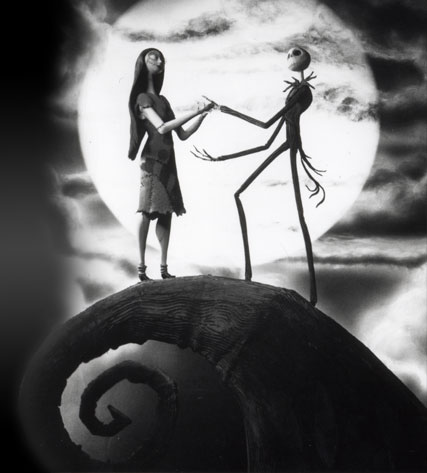
Aesthetic choices influenced by Time Burton films:
For my aesthetic choices I first wanted to re-imagine the environment in which I could set the story and how these environments could be interactive in a story driven way. The original story and illustrations were perceived as a blank canvas for me. I wanted to totally recreate the environment of the story but focus it around a certain aesthetic. I took a lot of influence from stories such as The Nightmare Before Christmas and Corpse Bride by Tim Burton. The aesthetic influence of this new age Gothic style fit perfectly with the original style and the personal style I wanted to inject into my own interactive book.
I created this border art to hold every scene together, almost every scene in the book has this border and it both centralizes the interactions and makes them obvious but also draws the readers eyes directly to the images that are to be interacted with.
Adding washed out colours and overlayed textures created the gothic theme.
The font used was key into tying together every aspect of the book. Where the user reads the dialog of the book the text is laid out spaced apart on the scrolling and accelerometer scenes so they are easily read.
End page ties directly back to the first scene below:
Adding a glow to the characters in some scenes where they are interacted with was a choice made for the purpose of interaction and not aesthetic, but I tried putting hints on the page but felt it took away from the charm of the interactions on the page.
The next scene is a scroller scene in which the reader can explore an entirely original environment that caters to both the illustrations and the story as you scroll through stitched up scenes of Duck and Deaths friendship. This scene is predominantly used for driving the story forward and establishing the relationship between the reader and the characters in a way that can be easily interacted with as there is a decent amount of text in the scene. But also it is a clever way to engage the reader into free scrolling backwards and forwards through the scene
A small clip of the final scroller scene. I made many layouts for this scene but felt this was the best for the scene, laying out the characters and the text was a challenger for a scroller page because I also wanted the background and environment to tie in to the dialog between Duck and Death.
This was the canvas used for the scroller level before I put the background in. Only foreground was used to layout the characters.
The tree climbing scene was a personal favourite of mine. Triggered by the accelerometer the reader tilts the screen to start the tree moving downwards on the screen to reveal a night time scene as the tree towers far above the earth. Along the trees trunk are story driven conversation sentences to keep the reader interested in reaching the top of the tree where Duck and Death are perched
The accelerometer page in its full length. I spaced the text out so that the user could go back or stop the text easily. I had to change the sensitivity and the speed at which the image moved with the acceleromete so that there was a natural progression of the text without it all going by too fast.
Backdrop for accelerometer page.
Moon page, initially I wanted the moon to be interactive by having the user press and drag it around the scene but because it had to be behind the foreground I couldn't get the ipad to sense the touch on the bottom image instead of the top.
This was the texture and border asset I created to overlay on most pages. The colour gradient draws the users eye in and also has a nice effect on the surrounding colours.
I wanted to keep the interactivity of the book as story driven as possible. The scenes are broken up in a way that drives the story forward but also builds the relationship and connection between the reader and the interactions. I used the built in accelerometer to my advantage as a way of moving large image based story elements across the screen at the readers pace, so the reader can go back through the scene and appreciate both the text and the illustrations. The mic was used for the first scene "one day Duck met Death" the reader literally blows the characters together in a kind of forced interaction into their inevitable meeting.
I wanted this scene to be a kind of cinematic experience where the reader changes the scene without a lot of interaction. Again though I wanted the story to be central to the interactions. Driving the story with simple interactions and beautiful illustrations was a key goal of mine and this scene encapsulates all areas nicely.
The music for the book is a hauntingly perfect gothic style track that plays through the entire book. The music for the book was essential to get right and luckily I found the perfect song for the style of the book.
Lastly, the coding process for the book was a real learning process, having never used the software or an ipad before I had to learn the functions of the ipad and how to code the images to react to these functions, photos of code would not do the amount of hours spent on it justice. But all I can say is that I am very pleased with how my interactive book turned out.


No comments:
Post a Comment