Tuesday, 2 July 2013

Conservation App - SpotsOn - Blogged

for the conservation app me and my team wanted to use the gps functionality of smart phones and apply it to our favourite spots around wellington. Spotson is an app where users can upload spots they think are interesting around wellington to a map that is central to the app. this map displays spots users upload and creates a unique page for the spot with an image gallery and user rating. 

For this project me and my fellow designer benni worked together on the aesthetic style of the app, functionality of user interactions and the design of the key pages on the app. 

Personally i worked with the UI buttons, icons and navigation feature at the bottom of every page.


Tuesday, 25 June 2013

Acclimatize Blog of Work

Acclimatize is a game where the player controls a turtle in a vast ocean reef in hopes of finding its hatching baby, all whilst avoiding clouds of pollution spewing from barrels polluting the water around.


The main goal behind this game was to create a beautifully immersive and ambient experience. Siding more towards the slow paced cinematic single life, single play through style of game as opposed to a fast paced high respawn style arcade game. Stylistically, me and Dylan, discussed many ways we could achieve this goal of a full immersion into both the turtle and its environment. We wanted the turtle to be the main focus at all times. We decided to completely negate the idea of HUD or any on screen representation of time or scoring.

The controls for the turtle are unique in that we used a flight simulator style control system to cater for all three planes of movement underwater, where the camera is controlled by the mouse and the AWSDQE keys are used to bank and move, forward, left, right and back.

We wanted to create an underwater atmosphere that was realistic but would also encourage exploration, the game was posed as being just as much about finding the end goal as it was about exploring the depths of the ocean and the reef mazes we wanted to create.

Drawing initial inspiration from thatgamecompanies 'Journey' we wanted to take the vast environment that rewarded exploration and the simple colour scheme and low poly appeal.


These low detail textures were our first experimentation with texturing our rocks and environmental assets:

Low Detail Texture

Low Detail Texture

I liked the low detail and minimal colour pallet, thought it suited with the Journey theme nicely.

After some deliberation and experimentation with textures and overall aesthetic style of the game we opted for a more high texture/ highpoly look. We did this because we found ways of creating realistic water and depth of field fog that really suited the underwater look we were going for. We then restyled the turtle as well to suit the new aesthetic.

High Detail Texture

High Detail Texture

High Detail Texture

I also UV mapped the model for the turtle so we could have multiple painted texture maps for the turtle.


These are some of the textures used for making brain coral. Sadly I don't think they made it into the final game.


This method of texturing spherical objects is called polarizing. The top pixels are stretched to remove seems.

I researched the kind of flora and fauna that is common in coral reefs around the world and started to create some 2D and 3D assets to populate the environment with. Ranging from seaweeds, rocks, boulders and corals.


Creating 3D assets for Acclimatize was a difficult process because we had some issues with frame rate dropping when we had too many objects in the level. This was one of the major draw backs of creating a game that had an expansive map, detailed models and visual effects for the camera.

I did some research into how to create low poly organic models and started working with 2D flat images that are then projected onto planar maps which are then distorted and bent into suitable positions to mimic the natural growth of plants without being high poly.

Unity has a built in feature to allow flat 2D image planes to always face the camera at a flat angle. This way grass (or for this game, seaweed) doesn't disappear when the character passes its location.

Assassin's Creed 3 did a really good job on their environmental assets. They had a huge amount of foliage and plants etc but kept them simple and low detail.


I tried to create my coral and sea plants and coral similar to the way current games do it.

Low poly rocks in AC3 show how important the textures are.

Research into low poly plant modelling methods.


Coral

Coral

Coral


Coral

Seaweed

Seaweed

Grasses

Grasses

Seaweed

Kelp


Kelp

Grasses

Above is a list of the flat 2D images I painted in photoshop to resemble organic structures found in coral reefs. When applied to planar maps they can be modeled to appear three-dimensional while still retaining a low poly count.


Above is the final product for a variation in models of organic plants. Some of them are poly-plane plants which act as small bushes that are comprised of multiple flat planes to appear 3D, others are skewed planar maps with flat images


This is an image of all the assets for the environment, ranging from pebbles, rocks, boulder, corals. 


Here is an image of the depth of field and fog maps used in-game.

Screen shots of the in game final product:


Sadly we had a lot of issues with frame rate and lag when we included huge amounts of assets. I think this was due to the camera and motion effects we added to the turtle and the depth of field. But these mechanics were so important to the illusion of an underwater experience that we couldn't find a way around it. If we had more time I'm sure we could have worked out how to increase both the poly count and frame rate but in terms of Acclimatize as a game I think I made some important choices for the style and aesthetic value of the game itself. Considering we wanted to capitalize on the ambiance and beauty we could create in an underwater environment I think we did a great job.

Final Video:


Monday, 6 May 2013

352 Ubiquitous Computing: Duck Death and the Tulip

When approaching this task of re-imagining a timeless story like Duck Death and the Tulip for an interactive app the most important thing was to always keep the original story close to the heart of the interactive experience. I wanted to capture the feeling and the soul of the original story. It is a story of inevitability. Children need to be taught the realities of life and death at some stage and Duck Death and the Tulip captures that some what unnerving conversation and puts it into a beautifully poetic metaphor of a Duck befriended by Death before his life comes to an end. It is in many ways an uplifting and heartwarming story as it is sad and grim.

Aesthetic choices influenced by Time Burton films:


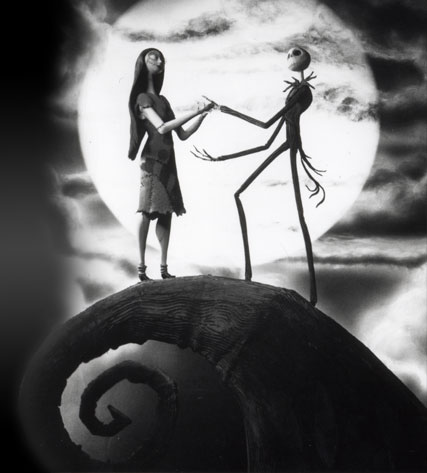
For my aesthetic choices I first wanted to re-imagine the environment in which I could set the story and how these environments could be interactive in a story driven way. The original story and illustrations were perceived as a blank canvas for me. I wanted to totally recreate the environment of the story but focus it around a certain aesthetic. I took a lot of influence from stories such as The Nightmare Before Christmas and Corpse Bride by Tim Burton. The aesthetic influence of this new age Gothic style fit perfectly with the original style and the personal style I wanted to inject into my own interactive book.


I created this border art to hold every scene together, almost every scene in the book has this border and it both centralizes the interactions and makes them obvious but also draws the readers eyes directly to the images that are to be interacted with.


Adding washed out colours and overlayed textures created the gothic theme.


The font used was key into tying together every aspect of the book. Where the user reads the dialog of the book the text is laid out spaced apart on the scrolling and accelerometer scenes so they are easily read.


End page ties directly back to the first scene below:


Adding a glow to the characters in some scenes where they are interacted with was a choice made for the purpose of interaction and not aesthetic, but I tried putting hints on the page but felt it took away from the charm of the interactions on the page. 

The next scene is a scroller scene in which the reader can explore an entirely original environment that caters to both the illustrations and the story as you scroll through stitched up scenes of Duck and Deaths friendship. This scene is predominantly used for driving the story forward and establishing the relationship between the reader and the characters in a way that can be easily interacted with as there is a decent amount of text in the scene. But also it is a clever way to engage the reader into free scrolling backwards and forwards through the scene


A small clip of the final scroller scene. I made many layouts for this scene but felt this was the best for the scene, laying out the characters and the text was a challenger for a scroller page because I also wanted the background and environment to tie in to the dialog between Duck and Death.


This was the canvas used for the scroller level before I put the background in. Only foreground was used to layout the characters.

The tree climbing scene was a personal favourite of mine. Triggered by the accelerometer the reader tilts the screen to start the tree moving downwards on the screen to reveal a night time scene as the tree towers far above the earth. Along the trees trunk are story driven conversation sentences to keep the reader interested in reaching the top of the tree where Duck and Death are perched


The accelerometer page in its full length. I spaced the text out so that the user could go back or stop the text easily. I had to change the sensitivity and the speed at which the image moved with the acceleromete so that there was a natural progression of the text without it all going by too fast.


Backdrop for accelerometer page.


Moon page, initially I wanted the moon to be interactive by having the user press and drag it around the scene but because it had to be behind the foreground I couldn't get the ipad to sense the touch on the bottom image instead of the top. 


This was the texture and border asset I created to overlay on most pages. The colour gradient draws the users eye in and also has a nice effect on the surrounding colours.

I wanted to keep the interactivity of the book as story driven as possible. The scenes are broken up in a way  that drives the story forward but also builds the relationship and connection between the reader and the interactions. I used the built in accelerometer to my advantage as a way of moving large image based story elements across the screen at the readers pace, so the reader can go back through the scene and appreciate both the text and the illustrations. The mic was used for the first scene "one day Duck met Death" the reader literally blows the characters together in a kind of forced interaction into their inevitable meeting.

I wanted this scene to be a kind of cinematic experience where the reader changes the scene without a lot of interaction. Again though I wanted the story to be central to the interactions. Driving the story with simple interactions and beautiful illustrations was a key goal of mine and this scene encapsulates all areas nicely.

The music for the book is a hauntingly perfect gothic style track that plays through the entire book. The music for the book was essential to get right and luckily I found the perfect song for the style of the book.

Lastly, the coding process for the book was a real learning process, having never used the software or an ipad before I had to learn the functions of the ipad and how to code the images to react to these functions, photos of code would not do the amount of hours spent on it justice. But all I can say is that I am very pleased with how my interactive book turned out.