Tuesday, 21 August 2012

Game Design - Project Two

Carrying on with my project one idea and concept. The baby Rhino was a theme that I thought could be easily adapted into platformer style game. Although there are many styles of platformers with numerous laws of gameplay and rulebinds this fact in turn worked in my favor for creating an original game with a unique concept of game play.


The player is in forced motion and only has the ability to jump and move forward, not backwards, this makes this game  play interesting and challenging as one mistake can result in a death. To make game play unique I thought to use the fact that the character is a Rhino and add a charge feature to the environment, giving the player the ability to charge through objects and barriers when needed.

Basic parameters include:

 Forced movement, no running back.
Charge and jump mechanics only.
Death at falling off screen or onto traps.
Revive at beginning of level.
Collect coins for a scoring system at the end of the level.
Environmental interactions slippery materials such as mud, slopes, jumps, gravity.
Pickups? Boosts or power ups: Speed boost? Shield? Coin magnet?
Character could use horn to charge through environment?? i.e. trees, rocks etc. 

Aesthetic values for the game include only vectored or high res backgrounds and textures, this is the modern prerequisites for any game now.


Some early sketches of the in game and level displays can describe with more detail the kind of game I want to produce:


The vision I had for gameplay elements was a kind of mix between Sonic the Hedgehog and Tiny Wings, the forced running with elements of curved slopes and spirals to make the level more dynamic for a platformer.

The paper prototype shows a simple level in play:


Friday, 17 August 2012

Research Diary - Walking and Texting

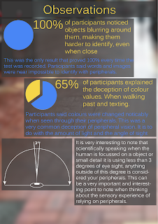
For my research diary I recorded five people walking down a street whilst texting a small paragraph into a hand held device. The idea behind this experience is that your senses are effected by the experience of having to rely on your peripheral vision to guide you as you walk. Here in lies many sensory experiences that go unnoticed, and when interviewed about their experiences participants said that once they had to think about their senses and analyze them was when they realized how intricate and complex their sense of vision
was when obscured.


This image is part of a collective group of artwork related to the study of peripheral vision, the idea was that you can recognize scenes and objects more clearly using peripherals then focused vision.


The process of walking a texting is the catalyst for the experience. It is hard to study the peripheral vision if you do not make it apparent, peripheral vision goes unnoticed so often because it is a natural process for the eye.

Recording the experience was a difficult task. It is hard to directly engage with another persons sight, and for this reason observing sight is a difficult process. To get over this hurdle is instead asked participants to tell me their experiences in words. I interviewed the participants both when they were walking and texting and after they completed the task. This was the way I collected my data. I repeated the process three times so that the participants could get an understanding both of their own sense and also how to answer the question. When asked generic questions about their experience I let them answer how ever they wanted in hopes of getting an honest and natural collection of data.


The diary itself is self explanatory and to the point. The results could be averaged out into five main experiences that went unnoticed. The fact that everyone could relate to the same experiences made the research accurate.

Some images were taken by the participants of their experience i.e. their field of view while walking and texting. Because a camera cannot illustrate the way a human eye sees an image recording research with video or camera becomes relatively unimportant, the real research and experience was within the verbalization of the experience, the interviews, the personal reactions and realizations of the participants when they have to verbalize a new experience. I felt that for my research this was the best method of collecting data.

However, I will include some images that the participants took while they were walking and texting:


 As you can see from the pictures they are not nearly as expressive of the experience as a verbal recollection.  But nonetheless it is important to see some pictures of the research to perhaps see what the participants saw, even if it does not communicate the experience as well as words.

Videos of the experience were recorded as well but were not nearly as expressive or accurate as an interview of the experience.

Friday, 3 August 2012

Background for In-Game Environment

This entry includes images used for in game environment and game play components. All were created using photoshop, flash and illustrator.

These tilesets for platforms were never used in the final game environment as they took away from the aesthetic and scale of the interaction. However, these would be very useful in creating a more dynamic and complex game style.
Tilesets for platforms

Backdrop
 This is the background used in the final simulation. It depicts a safari grass land at night with stars in the sky and thick grass with low mountains in the very back.
Terrain Style
This was the tileset used a basis for the final terrain tileset. Rocky and grassy, just like the African reserves.

Final terrain tileset clip
EXPLANATION OF STYLE

The environment was always going to be stylized adaptation of the natural environment of Rhinos. However the desaturation of the colour for the terrain tileset was a stylistic choice. I wanted the environment to evoke the feeling of the baby Rhino - sad, lonely and somewhat scary. The desaturation also aided to the night time aesthetic. By having the environment lacking in bright and over powering colours it does not take away from the character itself. In fact a brighter scene makes the character less important. By making the environment more dull the character stands out.

Final Character

This is the final HI-RES vectored character concept. At this stage I had brought him into flash and animated a list of cycles for the character's movement. With his head, tail, body and four legs moving in time it created a very believable walk cycle. 

The colouring for the Rhino was under much debate. After many iterations I settled on this kind of navy-blue and light brown tail. I made this choice because I wanted him to be recognizable as a baby Rhino. There are many dark skinned Rhinos in the world and also many light skinned. Their colours range from a very dark grey to the lightest of browns. This gave me a lot of real-world information on the natural colouring of Rhinos.

Final Character
This Rhino is meant to represent the baby Rhinos left abandoned in the wild motherless and defenseless. I wanted to encapsulate the colouring and aesthetic of baby Rhinos and I think this colour is a great colour that is not too over saturated but also not too dull. The characters skin can be noticeable at very small resolutions and this is thanks to the high lights on his upper legs and back.  

In terms of personality and individuality of the Rhino I really tried conveying his pain, sadness and helplessness through his face. This is another reason for the proportional scaling of the head and body. By having his head much larger then his body the viewer studies the face longer then the body as it is more imposed on the character then the body.

With this observation I gave my character large eyes, perked up ears, a worried mouth, frown lines and eye bags. These were all intentional characteristics given to the character to convey the point of animal cruelty and sadness emanating from the character itself.


 This is the sprite sheet used to create walk, jump and idle states for the basic animation of the platform style game. (CLICK TO SEE ACTUAL RESOLUTION)
This is the model of the mother Rhino I created to link the story of the baby Rhino to the real world issue. The mother stands motionless in the corner of the screen. Bruised and battered it links the idea that this mother has been poached or attacked. Her giant horn dwarfs the babies immature horns.

Thursday, 2 August 2012

Character Development

As a basis of research this image was used as a reference of size and shape of real Rhinos in the wild.


After a lot of sketches and proportional changes to the aesthetic of the baby Rhino character I came up with the final face and body structure. These are sketches of the orthographic front and side views of the Rhino.
Side

Front
The front of the character will never be seen (in game) but for a reference of size it is important to include.

Here are some vectored and coloured images of the final character. The skinning of the character and the patterns on the skin are a very important element to the character. The colouring is equally as important. I wanted an aesthetically pleasing colour pallet that would look good on a small window, I also wanted him to stand out, this is not an easy task. Often game characters have very vibrant and colourful skins with a high colour saturation. This was not the aesthetic I wanted my character to have. These colour pallets are mostly neutral blues, browns and purples.

I chose these colours because they are not so unlike the real colour of Rhino skin that the character becomes unrecognizable as a Rhino but they aren't real enough to drag the cartoon aesthetic of the Rhino and its proportions into looking under developed. I wanted the personal style of the character and the stylized skin to speak for them selves and stand out, instead of just becoming another colour tone on a character.
Aquamarine

Orange/Yellow

Grey

Dark Brown

Brown

Purple
These vectored shape of the character made him come to life. The colouring pattern works with almost any combination of tones. It is a typical THREE tone colouring, this is to describe the low, middle and high lights of the characters skin.

Initial Character Creation

Here a drawings of characters at their first conception. Many of them I did not take any further but some I developed. All in the process of deciding on the final character to take to the final stages of conception and development including colouring, personal touches and animation intent.
Penguin Shapes for 2D platform style
Sketches of underwater creatures


Owl character, could have taken this idea further

Power saving idea. There are many characters here that I developed around the idea of power.

Underwater characters. An arrangement of generic underwater creatures.

Spaceman idea. Could have played with the personality of this character to create a more dynamic character.

My favorite character concept was in fact a little rhino I drew after doing some research on animal conservation in Africa. The Rhino is one of the most endangered species on all of Africa. It is often poached for its valuable horns. The are hundreds of baby Rhinos that get separated from their parents. Poachers leave the babies because they have not matured enough to grow proper horns. This leaves baby Rhinos to fend for themselves in the wild without the care or support of a fully armored mother.

This act of animal cruelty struck a chord with me, I decided to make the baby Rhino my character.

Here are some initial ideas for the baby Rhino:


Shapes and sizes

More realistic approach, used as a reference for vector shapes.

Getting more into proportional balance for the baby Rhino.


Early ideas of Rhino styles, shapes and styles that were all combined in the character development. The shape and proportion of the baby Rhino is the most important aspect of creating this character because in a single glance at the character it is obvious that it is a baby.


Drawing of preferred Rhino design. 

Defined drawing

Proportional manipulation

Colour piece one


Colour piece two